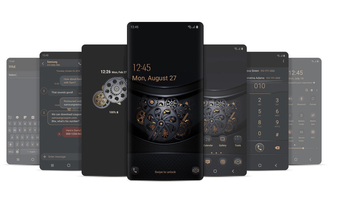
Precisely, the themed icons responsibly added fun to Andorid’s Material You. Gradually, they are welcome by more and more Android apps with each passing day. Talking about Android 14 Beta 3, whereby, themed icons undergo lots of rework. Subsequently, its upgrade is up in the air.
Android-themed icons succeeded in acquiring some color, with the recent beta release. Talking about this in detail, the backgrounds of each icon have more vibrant colors. Whereas, the color of the icon itself is also turned up a little. At the same time, the icons simultaneously lose a lot of their contrast with respect to past versions.
Well, this gives a mixed feeling with respect to this new look. While to some extent, it appears that it doesn’t fit the wallpaper as well, despite the color palette selection. At the same time, the icons feel less showy and a bit pale. They seem to appear better in light mode as compared to the dark mode. Whereby, the color roles tend to be reversed, this enables everything to line up a little better.
Noticeably, this is the first time when Google has made a major alteration to the look of themed icons. This is by the time of its initial debut. Since we try our best to reveal more about Android 14 Beta 3. So keep tuned for more information and details.
![]()
FOLLOW US ON SOCIAL MEDIA – Telegram, Twitter, Facebook, & Google News.

