YouTube Music still be working on changes, as lately, its updated version announced with the carousel button to the Now Playing interface…….!! After throwing out the changes to the app the top corner doesn’t feature “Playing from.” Which was first introduced in the now-abandoned mid-November redesign.
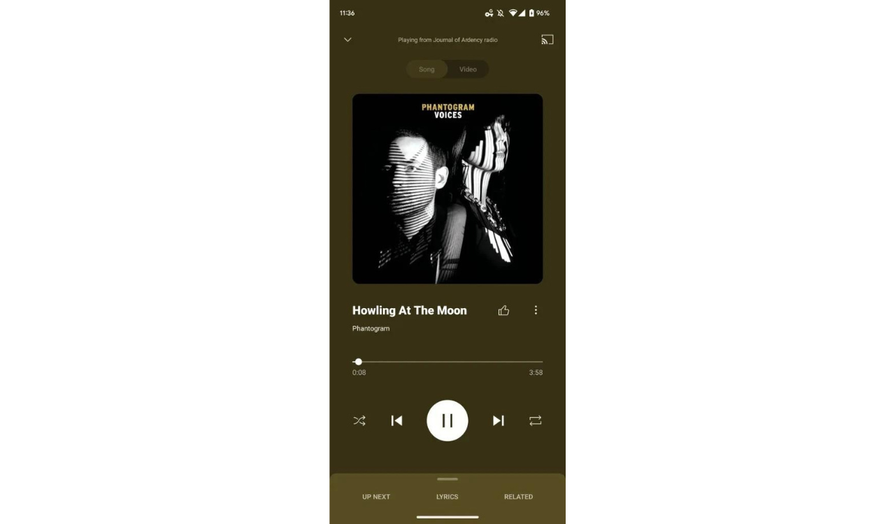
The rounded corners are much more prominent than before, as the album cover now takes up slightly more space on the interface. The artist/song name is aligned left on the new interface, just like in the now-ditched YouTube Music Now Playing redesign on Android. And then, there’s the carousel. Rest remains intact like the video/song switcher, and overflow menu, alongside the Cast button.
YouTube Music adding a carousel button in its updated version
Following the update the music app has been revised partially including one of the most exciting new feature is a carousel of actions. This allows users to download, share, and save their favorite songs easily. The existing thumb-up/down buttons aren’t appearing on either end of the song name. Instead, they’re united in a separate section on the farthest left of the carousel, just below the song/artist name.
Expectedly, afterward, the old design was returned to Now Playing for Android smartphones. In case you missed it, YouTube Music launched the Now Playing update, initially for Android devices in mid-November, drained at the beginning of this year.
Additionally, a live lyrics function is something specifically audience has been demanding for some time. That is yet to be there, unfortunately, it is still awaited from Now Playing.
FOLLOW US ON SOCIAL MEDIA – Telegram, Twitter, Facebook, & Google News.

