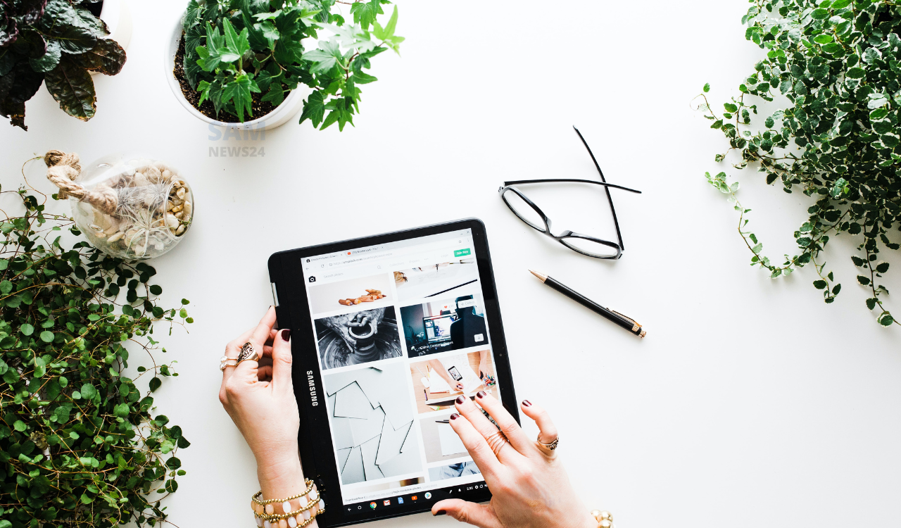
Google Discover layout is now getting a new enhancement in terms of user experience. The Pixel phone maker company Google has started improving its first-party apps with large-screen optimizations since I/O 2022. Recently introduced three-column UI for Google Discover on tablets is now reportedly rolling out for some tablets including Samsung tablets.
Ahead of Google Pixel Tablet the updated Google Assistant and Discover are rolling out to existing tablets, including Samsung’s Tab S8 with Google app version 14.2.7.26 (current beta) (via 9To5Google).
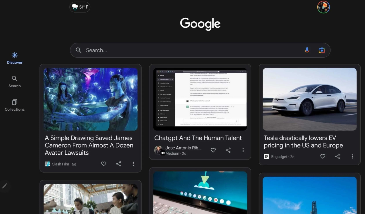
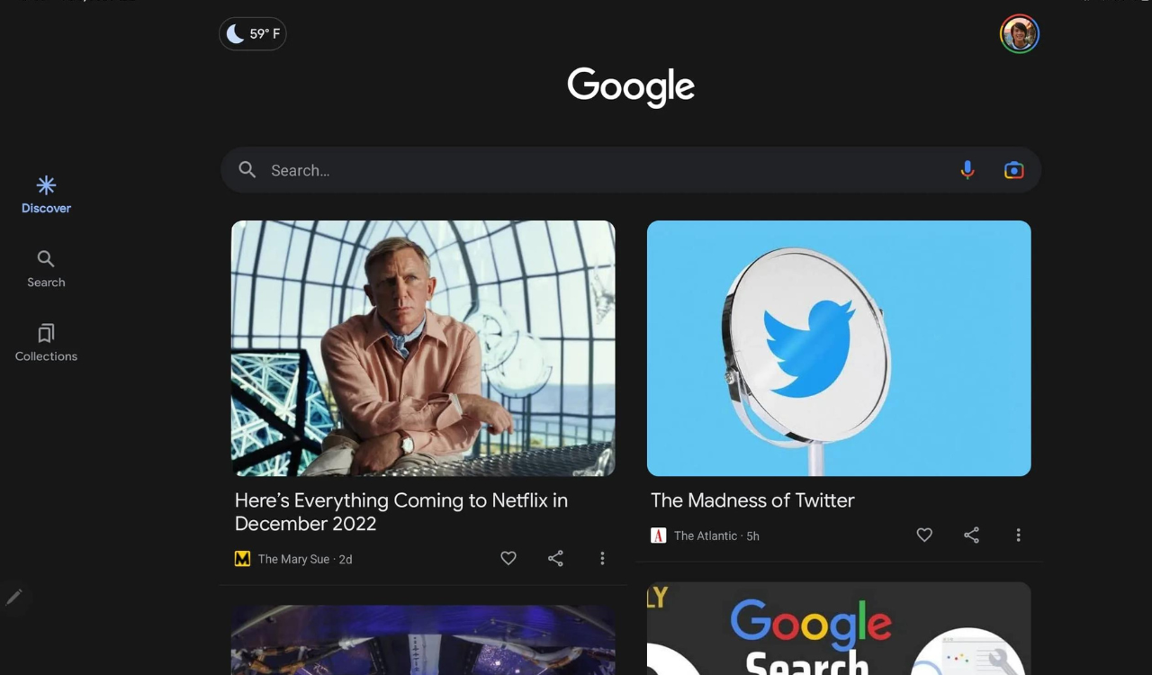
The latest UI will show you three columns instead of two articles. Also, the latest Google Discover change lets you show the effect to the left of your home screen with a black background, while the Google logo and your profile avatar are moved to the top corners. The navigation in the Google app is now looking better without the empty space. Meanwhile, the three columns will place all articles in cards with faint outlines, while cover images get smaller.

